TD’s Global Navigation
Aligning Cross-Border Content Within a Canadian-Led Framework
The challenge
As part of a Canadian-led initiative, a new “SuperNav” mega menu was being rolled out across td.com (in Canada and the U.S.) to improve wayfinding and unify the global site experience. While the visual and structural design was largely set, the U.S. team’s role was to evaluate how our content—spanning personal banking, small business, commercial, investing & wealth, and about us—fit into this new architecture.
This wasn’t just a design task—it was a content and strategy puzzle.
Fitting U.S. Content into a Canadian Framework
I partnered closely with our U.S.-based content strategist and worked hand-in-hand with each line of business to:
Audit and map all U.S. web content to the new SuperNav structure
Ensure accurate categorization and representation for each business area
Advocate for terminology and navigation labels that reflected U.S. market language and user expectations
Balance legal/compliance constraints with clarity and usability
This work required ongoing negotiation—both with internal stakeholders and our Canadian partners—to make sure the new structure didn’t just look good but actually worked for our users.

The new navigation structure (above) is quite robust and different than current state.
U.S. User Testing & Insights
While the Canadian team had conducted research on their side, we knew it was essential to validate the nav system with our U.S. audience. We conducted:
Usability testing on menu labels and category groupings
Task-based studies to evaluate content findability across navigation states
A deep dive on navigation toggles between Personal, Business, and other key verticals
Through this testing, we uncovered a major flaw in the experience:
When users wanted to switch between navigation types (e.g., Personal → Business), they couldn’t find the toggle, or thought it was part of the login experience.
Raising Red Flags & Driving a Solution
We brought our findings back to our Canadian counterparts and collaborated to evolve the nav design. While it was tough feedback for the originating team to hear, they were open to iteration. Together, we:
Proposed a horizontally-aligned menu lockup that retained the core SuperNav design but clarified the distinctions between major business areas
Ensured this revised structure met U.S. compliance and accessibility standards
Pushed back the launch for both the U.S. and Canada
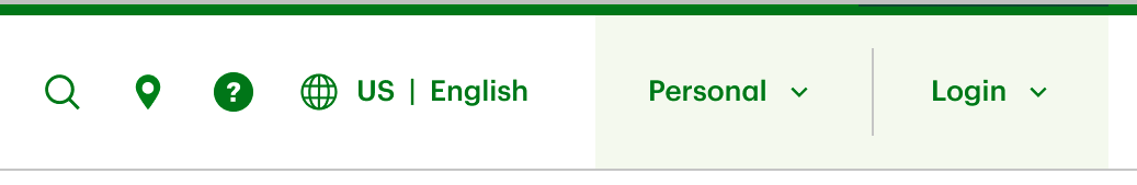
Users had trouble locating the Personal banking dropdown and navigating between the other website sections (Commercial, Small Business, Investing & Wealth, About Us) in testing
Cross-Border Collaboration at Its Best
This project was a case study in navigating complexity—literally and figuratively. I acted as a bridge between U.S. business teams and the Canadian design owners, translating research insights into actionable changes and advocating for the needs of our U.S. customers within a shared design system.
Takeaway
Even when you don’t own the design, you can own the user experience. This project showed how rigorous content strategy, thoughtful testing, and respectful collaboration can shape global design systems into something that actually works across borders.

The Canadian design team is working on a variant for the U.S. which displays all of the sub-sites (Small Business, Commercial, etc.) in a line as it is on the website now. Above, an example from TD Asset Management, a sub-site in Canada. This navigation will roll out sometime in the fall 2025.