ROLE
Design Strategist & UX/UI Lead
TEAM
Design Strategist/Lead
3 Mid-Level Designers
Design Researcher
Cross-Border UX Team (Canadian Platform Team)
THE WHY
Push from leadership to modernize our design system with limited budget for a full redesign
Overview
TD.com is a legacy platform powered by a rigid component-based design system built in Adobe Experience Manager (AEM). Our design system has limited flexibility for modern UX needs. Rather than pursue a costly and time-intensive system overhaul, my team set out to evolve the current design system from within—by hacking, stretching, and reimagining components to better support a refreshed user experience.
Our guiding principle: design within the system’s constraints, but always pushing creative boundaries and securing buy-in from various Design Team stakeholders throughout the division.
My team was looking at ways to re-skin existing components/modules to give them a more modern look and feel, while staying within the boundaries of the design system.
The Challenge
The existing TD.com design system was not built for agility. Components were narrowly defined and purpose-built, leaving little room for customization or nuanced use cases.
A prime example was the TD Clear credit card product—unique to the U.S. market and featuring multiple tiers. Our system had no pattern to support the complex comparison needs this product required.
Our central problem statement:
The design system is too rigid to accommodate modern user needs and evolving business requirements.
Our Goal
Refresh the TD.com experience without rebuilding the system. Instead, extend the design system by hacking and modifying existing components to create improved UX patterns and visual polish—while staying within development feasibility and accessibility standards.

We looked at existing components and found ways to update/modernize the look and feel without breaking the back end technology
Key Solutions
To bring this vision to life, we led a series of design and testing efforts aimed at evolving components, including:
Modified Banner Components
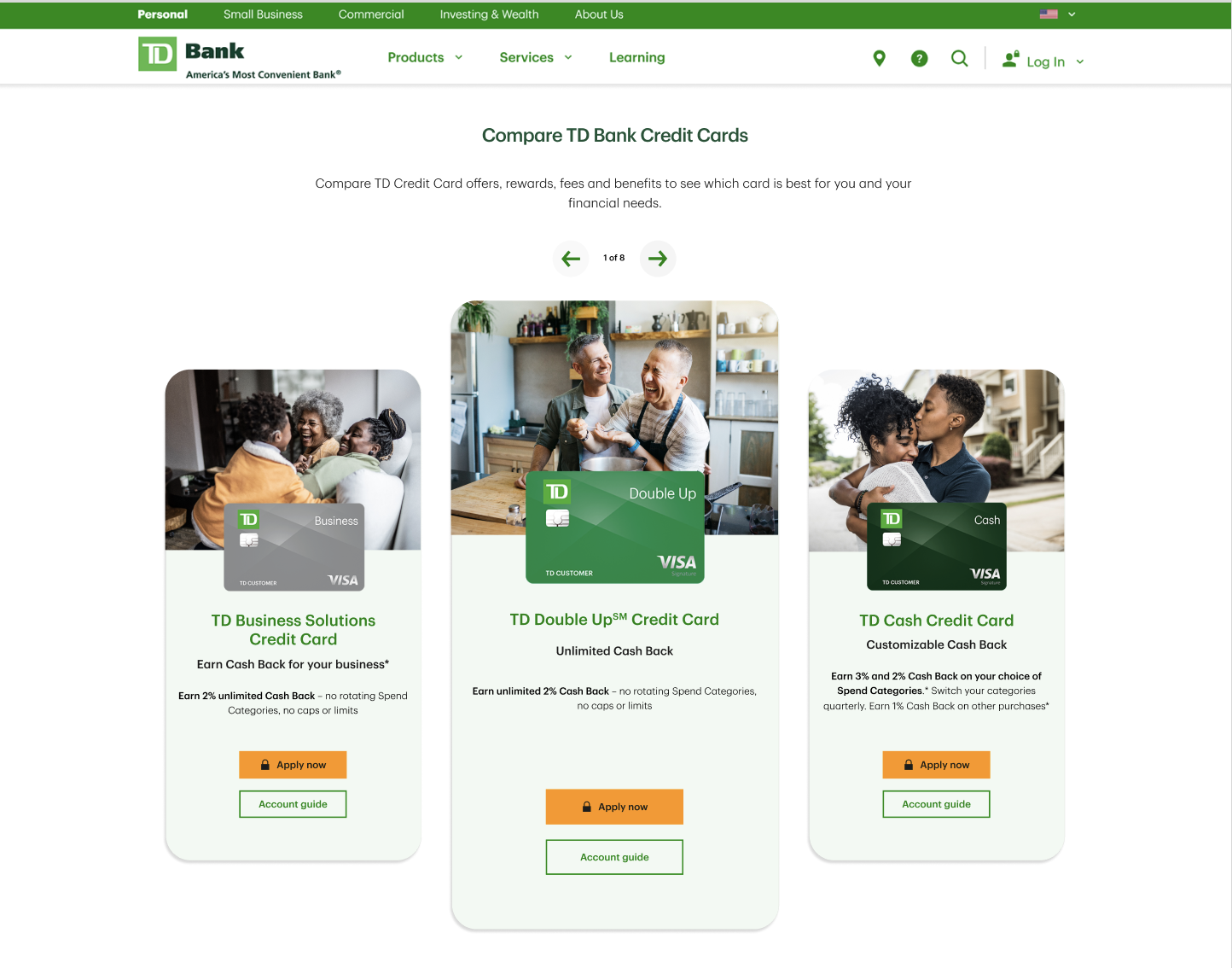
Found ways to “hack” the existing banner components to modernize the typography and layout.Modified Table Component
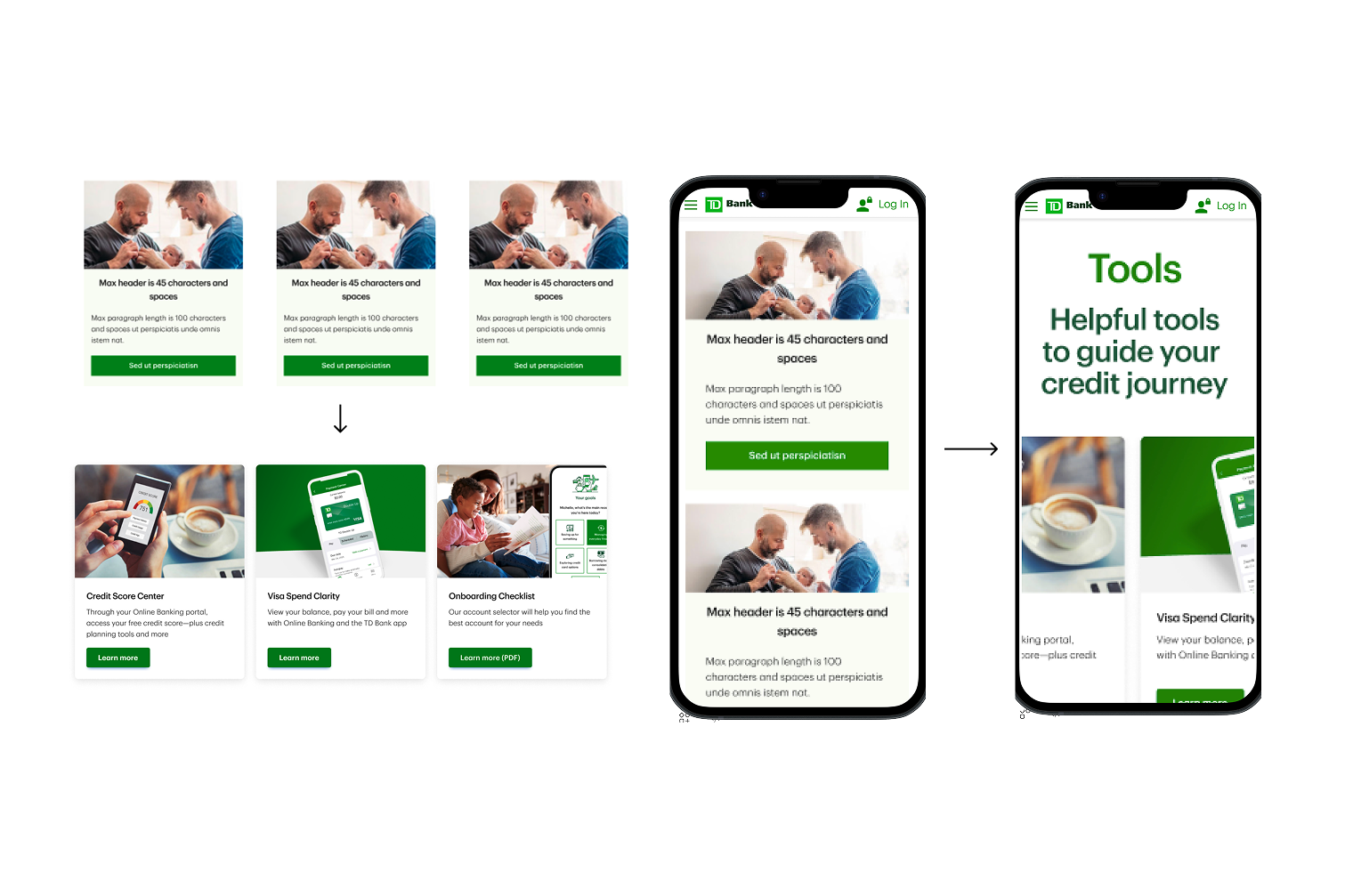
Reimagined the traditional data table to accommodate more responsive layouts and comparisons, especially for mobile use cases like credit card benefits.Chip Filters for Mobile Type Hierarchy
Enhanced content scannability and discoverability on smaller screens by redesigning filter chips and aligning them with a more intuitive mobile type scale.Cross-Platform Product Comparison Tool
Created a modular comparison interface—essentially a tabbed system—by creatively combining existing components, allowing users to compare TD Clear credit card tiers seamlessly.
We user tested some new comparison tools and are working to build new components and update some existing ones

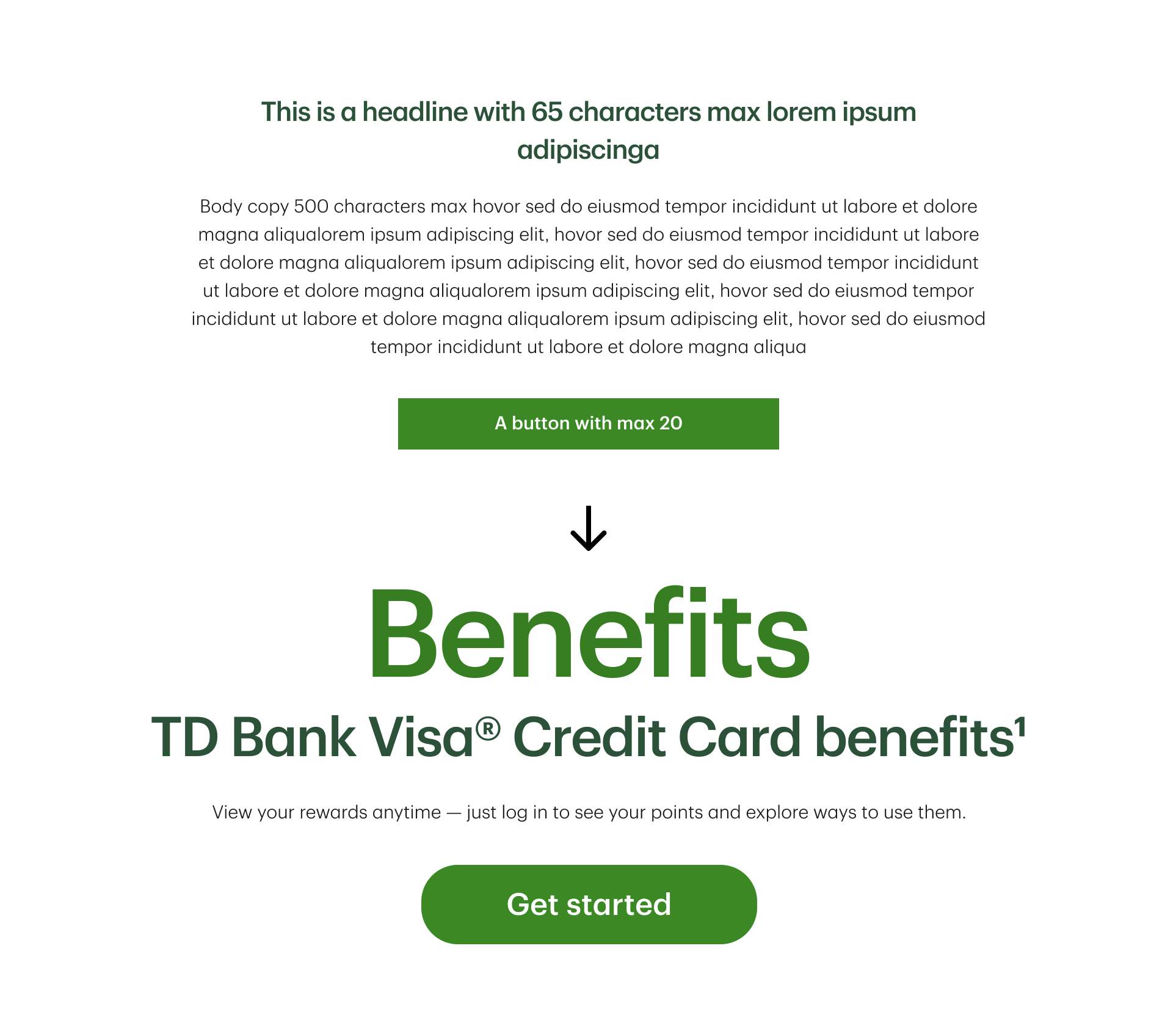
We user tested a new type hierarchy, as well as button styles/shapes. On desktop, users found the larger sizes refreshing, while on mobile, overwhelming. Our design systems team is digesting the user feedback and working on a new type hierarchy for the enterprise.
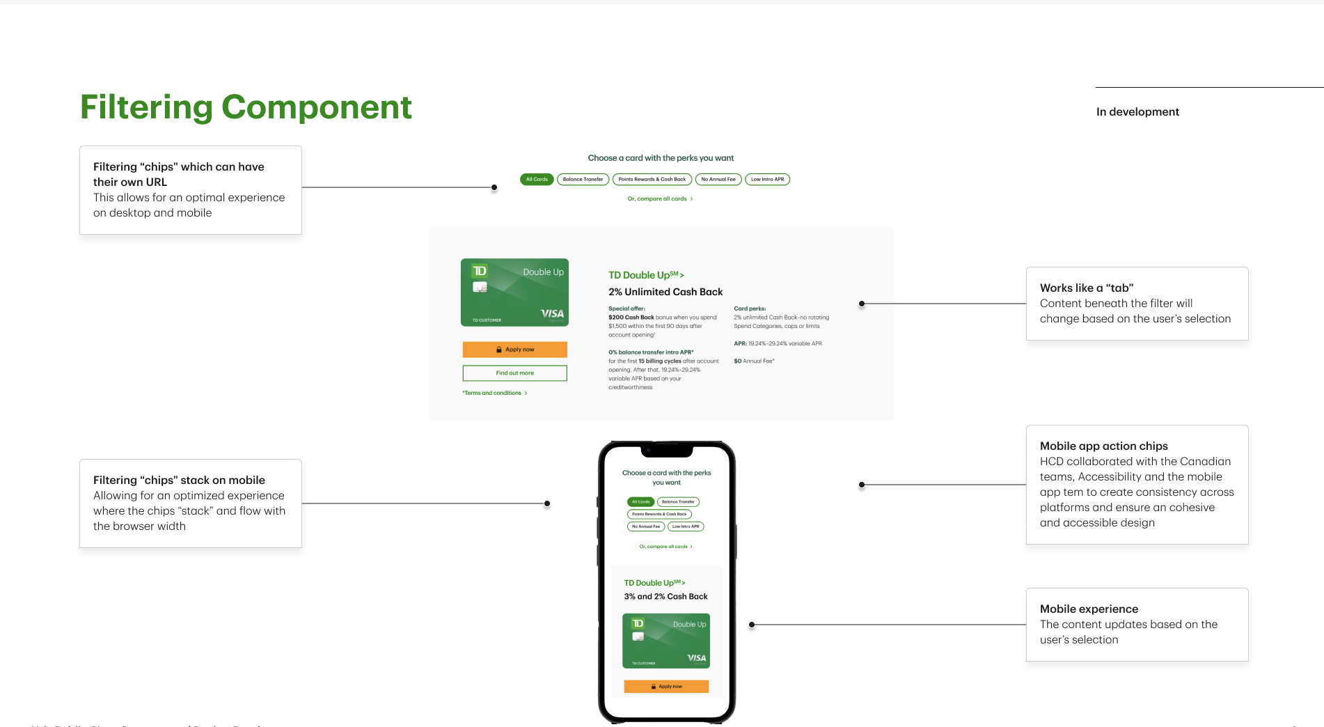
We’ve modified some of the UIs for filtering components (like the one above), based on usability testing, to allow for a more mobile-friendly experience within our design system. Below, a design concept for using the new filters to help users narrow down products

The Process
Gap Identification
We audited our component library against real business needs and prioritized gaps based on product and user pain points.
User Testing and Feedback Loops
As we redesigned pages for checking accounts and credit cards, we tested concepts directly with users. This informed both our roadmap and component-level decisions.Cross-Team Collaboration
We partnered closely with:Our Canadian counterparts to stay aligned and share learnings
The Accessibility Team to ensure all enhancements met WCAG standards
The Brand Systems Team to preserve brand integrity while iterating on UI patterns
Design "Stretching" Exercise
I asked every designer on our team to produce two versions of each concept:One within our existing component constraints
One completely unconstrained, to drive innovation
Outcomes & Impact
We gained leadership buy-in to staff up our scrappy pod, successfully advocating for the addition of:
1 Design Researcher
1 Business Analyst
2 Developers
1 QA Tester
Despite having just one pod (vs. eight in Canada), we created a roadmap more robust than theirs, maximizing efficiencies and impact through tight collaboration and fast iteration.
Key Takeaways
Design constraints can be powerful creative catalysts. By encouraging "component hacks" and out-of-the-box explorations, we built smarter, leaner solutions that felt new—without starting over.
Collaboration is everything. We built strong relationships across UX, development, accessibility, and brand—positioning design as a strategic partner.
Small teams can drive outsized impact. With vision, rigor, and scrappiness, our team of one pod outpaced much larger teams with thoughtful, user-tested innovation.